Tuesday, August 26, 2008
Thursday, August 21, 2008
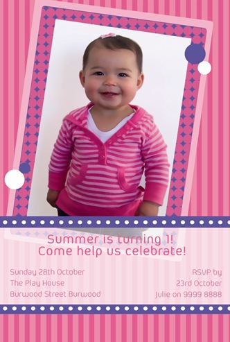
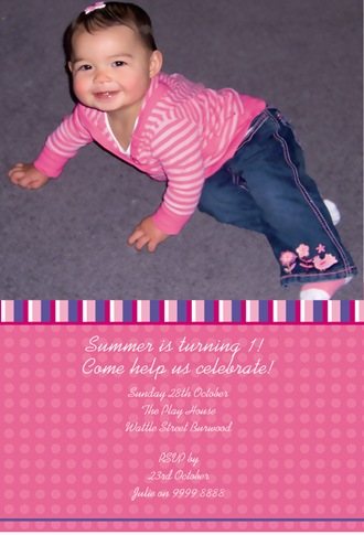
Summer is turning 1!
Summer must be one of the cutest toddlers ever! For a true girlie-girl we designed something purple and pink- it doesn't get much girlier than that!
Monday, August 18, 2008
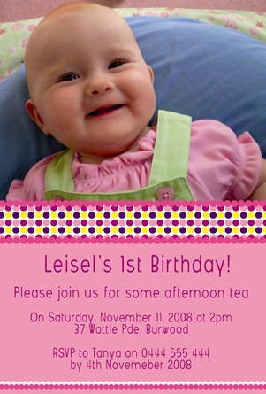
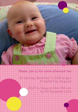
Leisel's first birthday!
The brief was to keep it modern but girlie, using the colours pink, purple, yellow and hot pink. With such a lovely photo and smiley baby, its hard not to nail it!
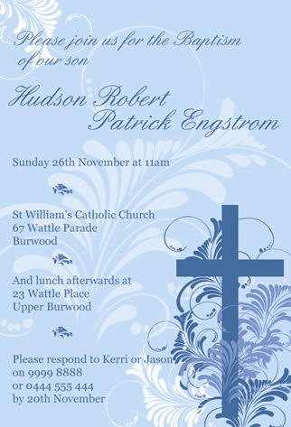
Beautiful blue for Hudson
A classic and stylish Christening-invitation for baby Hudson. I used a palette of icy blues, ivory and lavender to create texture and depth in the design.
Tuesday, August 12, 2008
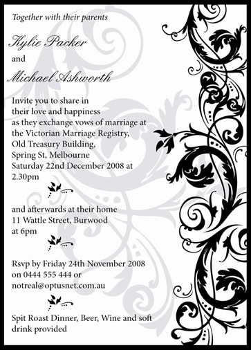
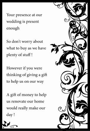
A black, white and silver-themed wedding
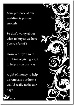
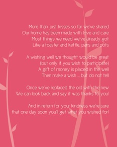
Simple, stylish, elegant and clean; you can't go wrong with black and white. The bride-to-be liked both wishing-well cards so much she will use them both. A simple yet beautiful design that can easily be applied to order-of-service, place cards, Thank You-cards, bonbonniere and so on.
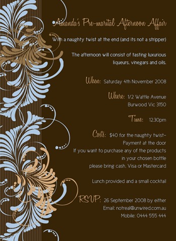
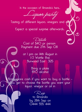
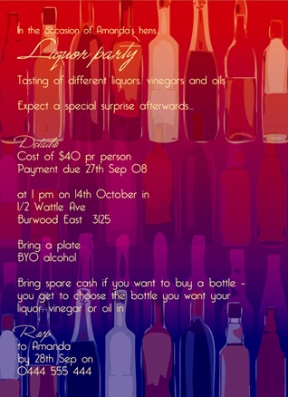
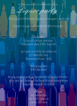
Amanda's liquor-infused Hens
I did three different designs for Amanda while staying within the same sort of lay-out. The use of colour and type can really change an invitation from being classic and conservative to girlie and fun.
Monday, August 11, 2008
A winery-tour getaway for the Hens
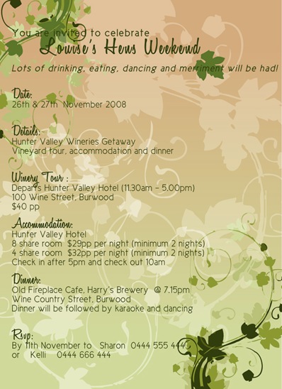
Another job that I really, really enjoyed designing. I used a dreamy spring-green background with lots of vine-motifs around the text. I kept the text simple yet feminine, and designed the invitation closely around the theme for the getaway.
Friday, August 8, 2008
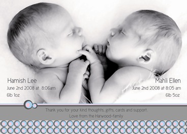
An addictive job.... Twins!
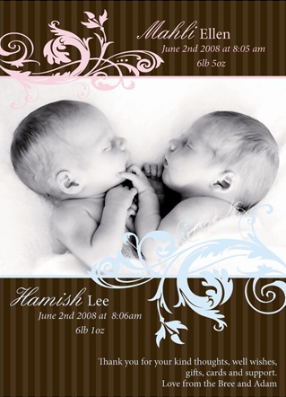
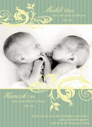
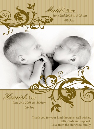
Anyone who knows me know that I have a massive soft-spot for newborn twins. Maybe because I have been there and done that, or maybe because it looks so incredibly magic and beautiful? This was one of those jobs where I found it hard to stop- I could really get carried away! The amazing photo is courtesy of talented lifestyle-photographer Kristen Cook www.kristencook.com.au . The twin birth-announcement required colours to reflect both boy and girl. I went for 1 traditional and classic design, and 1 modern (bottom). Mum and dad chose the top one in the end, a baby pink- and blue combo on deep chocolate brown. Enjoy your little babies, its a magical and intense time that passes too quickly!
Thursday, August 7, 2008
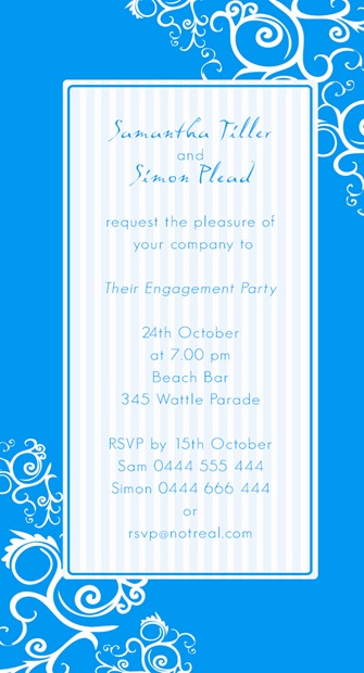
Engagement-party by the beach
A cocktail-party in a bar by the beach; what better way to celebrate an engagement? The couple wanted a beachy feel without the cliches of sea-shells and sails. I used a bright aqua combined with crisp white, stripes and swirls to capture the "look and feel" of a trendy bar by the beach.
Wednesday, August 6, 2008
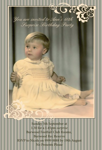
A surprise 60th birthday
This gorgeous old photo became the inspiration for the palette I used, consisting of sage-green, buttery yellow and peachy pink. I wanted the invite to reflect the charm and age of the photo itself.
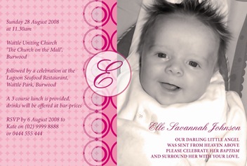
Elle's Baptism
A pink version of Jay's and Lachlan's retro-inspired blue designs. Since Elle is still only young, I replaced the "1" in the circle with her initial. Its handy if her parents decide to follow up with a Thank You-card or other ideas later than the track, so they can keep within the same style of design and that way tie it all together with a theme.
Tuesday, August 5, 2008
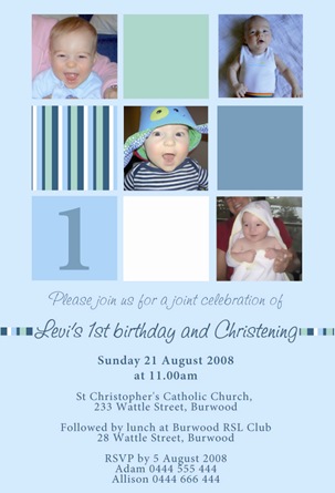
The many faces of Levi
What better way than to use the square-collage design when you have many photos you love? This one is a combined christening/birthday-party invitation for Levi, and man of many faces, moods and expressions...
Monday, August 4, 2008
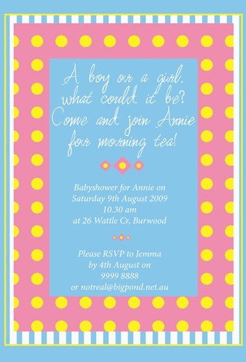
Kitsch morning-tea, anyone?
The mother-to-be wanted a very specific look for her baby-shower invitations. We ended up with a mix of retro, kitschy and shabby-chic, unusual but still reflecting the colour-scheme she wanted; something suitable for both boy or girl. Good luck when the big news arrives in a few weeks!
Sunday, August 3, 2008
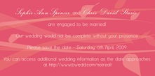
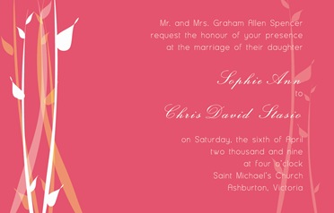
An autumn-wedding....
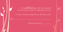
A series consisting of a Save the Date, an invitation, a Wishing Well-card and an RSVP-card. Sophie and Chris are getting married in autumn and wanted their wedding stationery to reflect the colours of the season. They are planning a warm, intimate wedding and chose a colour-scheme that embraced both this and the venue, Chris's family-orchard and farm.
Part Three of Oliver's baptism
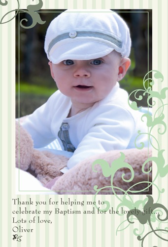
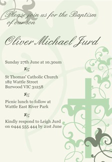
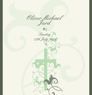
I've done the invitation and the candle-wrap for Oliver's baptism, and now we've finished the project with his Thank You-cards. Its hard to fail with such a cutie in the photo! We based the colour and style on his sage-green outfit, and kept it classic and clean. In case you haven't seen the previous work for Oliver, here it is:
Invitation
Candle-wrap (it looked amazing when wrapped around the candle)
The funniest photo you'll ever see: Lachlan
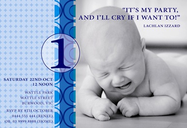
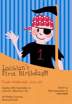
In Lachlan's case we went from a Black and Red Pirate-themed birthday to a simple, blue and funky concept. The pirate-design gave me a change to dive into illustration again, while the photographic design Lachlan's parents went for in the end gave me a good laugh. What a wonderful photo!

